If you’ve ever built a site that loads like it’s stuck in 2006, you already know — visuals can be the biggest culprit. Big images, auto-playing videos, uncompressed templates… they all look great until your bounce rate shoots through the roof.
The truth is, most of us don’t think about optimization until the damage is done. But if you fix a few small things early, you can make your site faster, cleaner, and more SEO-friendly without losing quality. Here’s what’s been working for me lately.
Visual content is usually the heaviest part of any web page. Photos, banners, icons, embedded videos, and design templates can easily account for most of the data a visitor has to download. Heavy pages load slowly, frustrate visitors on mobile connections, and can hurt search visibility, because page experience is one of the signals search engines consider. The good news is that visual optimization follows a small set of repeatable habits. This guide walks through each one, explains why it matters for speed, accessibility, and SEO, and gives you a simple checklist to apply before you publish.
Why Visual Optimization Matters
Speed is part of user experience. Visitors judge a page within seconds, and many leave if content takes too long to appear. Search engines measure real-world loading behaviour through metrics such as Largest Contentful Paint, Cumulative Layout Shift, and Interaction to Next Paint. Large, unoptimized images are a frequent cause of poor scores, especially when the biggest image on the screen is the element that determines how quickly the page feels ready.
Accessibility and SEO are linked too. Descriptive alt text, sensible file names, and well-structured media help people who use screen readers, and they help search engines understand what each image represents. Optimization is therefore not just a technical exercise; it makes your site better for everyone.
1. Choose the right format from the start
This part sounds boring, but it matters. JPEG, PNG, WebP — they all have their place.
- JPEG is perfect for regular photos. Small size, solid quality.
- PNG is better when you need sharp detail or transparency (like logos or icons).
- WebP is newer, lighter, and works on most browsers now.
When I grab assets from free images libraries like Pikwizard, I usually download in the highest resolution, then convert them to WebP before uploading. Keeps everything crisp but lighter.
A few extra notes on formats:
- SVG is ideal for simple logos, icons, and illustrations because it scales to any size without losing sharpness and is often tiny in file size.
- AVIF can compress even better than WebP in many cases, though tool and browser support should be checked for your audience. Many sites serve it with a WebP or JPEG fallback.
- GIF is rarely the right choice for animation anymore. Short looping videos or animated WebP files are usually far lighter.
Whatever format you choose, size matters as much as type. An image displayed at 800 pixels wide does not need to be uploaded at 4000 pixels wide. Match the dimensions to the largest size at which the image will actually appear, and consider offering several sizes using responsive image attributes so that phones download smaller files than large desktop screens.
2. Shrink your files before they hit the web
Never upload full-size photos straight from your camera or stock library. It’s like trying to fit a billboard into a blog post.
There are tons of quick tools that handle this — TinyPNG, Squoosh, or ImageOptim all do a great job without wrecking quality.
If you’re working with free templates or transparent PNGs from Pikwizard, they’re already clean and easy to compress. You can usually get a 50% smaller file with no visible difference.
There are two main kinds of compression. Lossy compression removes some data that the human eye is unlikely to notice, producing much smaller files. Lossless compression reduces size without discarding any visual information, which is useful for graphics where accuracy matters. For photos, a moderate lossy setting is usually the best balance. Compare the compressed result with the original at full size, and lower the quality only until you start to notice differences.
If you manage many images, automate the process. Plugins, build tools, and content delivery networks can compress and convert images on upload or on the fly, which keeps the workload manageable and the results consistent.
3. Add real alt text, not keyword stuffing

Image by Pikwizard.com
Alt text isn’t just a box to fill out — it actually helps people using screen readers and tells Google what’s going on in your image.
Keep it short and clear. Something like:
“Team brainstorming ideas in modern office – Pikwizard stock photo”
You don’t need to jam in five SEO terms. One good sentence is enough.
Good alt text describes what the image shows and, where relevant, why it matters on the page. A chart might be described by its key takeaway, while a purely decorative divider should have empty alt text so screen readers skip it. Avoid starting with “image of” or “picture of”, since assistive technology already announces that it is an image.
File names help as well. A name like team-brainstorming-modern-office.webp is far more useful than IMG_4821.webp. Use lowercase words separated by hyphens, and keep it brief. Together with alt text and nearby page content, descriptive file names give search engines clear context.
4. Use lazy loading (seriously)
Lazy loading basically delays your images or videos from loading until someone scrolls to them. It’s such an easy win for performance that it should be on by default.
If you’re on WordPress, it’s already built in. If not, you can usually toggle it with one line of code or a plugin.
In plain HTML, adding loading="lazy" to an image tag tells the browser to wait. There is one important exception: do not lazy-load the main image at the top of the page, often called the hero image. That image should load as early as possible because it usually determines how fast the page feels. Reserve lazy loading for content below the fold.
Also specify width and height attributes for images so the browser can reserve space before the file arrives. This prevents layout shifts, where content jumps around as images load, which is both annoying for users and harmful to your Core Web Vitals scores.
5. Watch your videos
Videos are heavy. If you’re hosting them yourself, compress them and keep the resolution realistic — not everything needs to be 4K.
If you’re embedding from YouTube or Vimeo, use a “lite” embed option so the video player doesn’t load until someone clicks play.
Pikwizard actually has a bunch of short stock video clips you can drop in if you want motion without the bulk of a massive file.
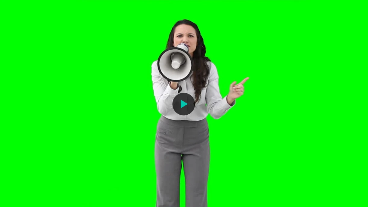
Image by Pikwizard.com
Some practical video habits:
- Avoid autoplay with sound, which annoys visitors and is blocked by many browsers.
- Provide a poster image so something appears immediately while the video loads.
- Offer captions or a transcript, which improves accessibility and gives search engines more text to understand.
- For short background loops, use muted, compressed clips rather than heavy files.
- Consider a streaming platform or video CDN for long videos so visitors receive the right quality for their connection.
6. Keep templates simple
I love design templates, but they can get messy fast. Too many layers, effects, fonts — it all adds up.
Before uploading, flatten what you can, resize it properly, and export at web resolution. A smaller, cleaner file looks the same online and loads in half the time.
The same idea applies to website themes and page builders. Every extra font weight, animation library, and plugin adds files the browser must download and process. Audit your templates for unused styles and scripts, limit the number of custom fonts, and use system fonts where design allows. Fewer moving parts mean faster pages and fewer things that can break.
7. Always test before going live
Once everything’s uploaded, run your page through something like PageSpeed Insights or GTmetrix. You’ll spot what’s slowing things down right away.
A few tweaks — smaller images, compressed videos, lighter templates — can move your load time from “ugh” to instant.
Test on a real phone as well as on desktop, ideally on a mobile connection rather than fast office Wi-Fi. Look at both lab results and real-user data where available. Re-test after you add new plugins, banners, or embeds, because performance tends to degrade slowly as sites grow.
Responsive Images and Delivery
Even a perfectly compressed image can be the wrong size for a visitor’s screen. A phone with a narrow display does not need the same file as a large desktop monitor. Responsive image attributes, such as srcset and sizes, let the browser choose from several versions of the same picture and download only the one it needs. Many content management systems generate these versions automatically when you upload an image, so check that this feature is enabled in your theme.
A content delivery network, or CDN, adds another layer of speed. It stores copies of your files on servers around the world and delivers them from a location close to each visitor. Many CDNs can also convert images to modern formats automatically and resize them on request. Combined with browser caching, which lets returning visitors reuse files they have already downloaded, a CDN can noticeably reduce load times without requiring you to edit every image manually.
Accessibility Beyond Alt Text
Optimized visuals should also be usable by everyone. Make sure text placed over images has enough contrast against the background, so it remains readable for people with low vision. Avoid putting important words inside images, since text in a picture cannot be resized, translated, or read by screen readers. When a graphic carries meaning, provide the same information in nearby text.
For video and audio, offer captions and transcripts. They help people who are deaf or hard of hearing, viewers who watch without sound, and anyone in a noisy place. Transcripts also give search engines readable text to index. Finally, avoid flashing or rapidly moving content, which can be uncomfortable or unsafe for some users. Small accessibility choices made while optimizing media often improve the experience for every visitor.
A Quick Pre-Publish Checklist
- Choose an appropriate format (JPEG, PNG, WebP, SVG, or AVIF).
- Resize to the largest displayed dimensions.
- Compress with a trusted tool and compare quality.
- Name the file with clear, hyphenated words.
- Write short, descriptive alt text.
- Set width and height attributes.
- Enable lazy loading for below-the-fold media, but not for the hero image.
- Use lightweight embeds and compressed video.
- Simplify templates and remove unused assets.
- Test speed and accessibility before and after publishing.
How Much Faster Can You Get?
Results depend on where you start, but the pattern is consistent. Sites that begin with oversized photos and heavy templates often see the largest gains from the simplest changes: resizing, compressing, and switching to modern formats. After those basics, lazy loading and lighter embeds reduce the work done during the first screen. Finally, caching and a CDN help repeat visitors and international audiences. Measure before and after each step so you know which change delivered the improvement, and keep a short record of your settings so a new team member can follow the same process.
Common Mistakes to Avoid
- Uploading original camera files. They are often several megabytes each.
- Relying on CSS to shrink images. The browser still downloads the full file.
- Stuffing alt text with keywords. It harms accessibility and looks spammy.
- Lazy-loading everything. Above-the-fold images should load immediately.
- Ignoring mobile. Most visitors browse on phones, where bandwidth is limited.
- Forgetting to re-test. New content can undo earlier improvements.
Final Thoughts
Good SEO isn’t just about keywords anymore. Google cares about how your site performs, and users definitely do too. Fast, accessible visuals are a big part of that.
When you’re working with stock images or templates, start with lighter, flexible files. I use Pikwizard a lot because their stuff looks professional but doesn’t come with huge file sizes. Makes life easier.
Tweak a little, test often, and don’t overthink it. A few smart changes go a long way.